
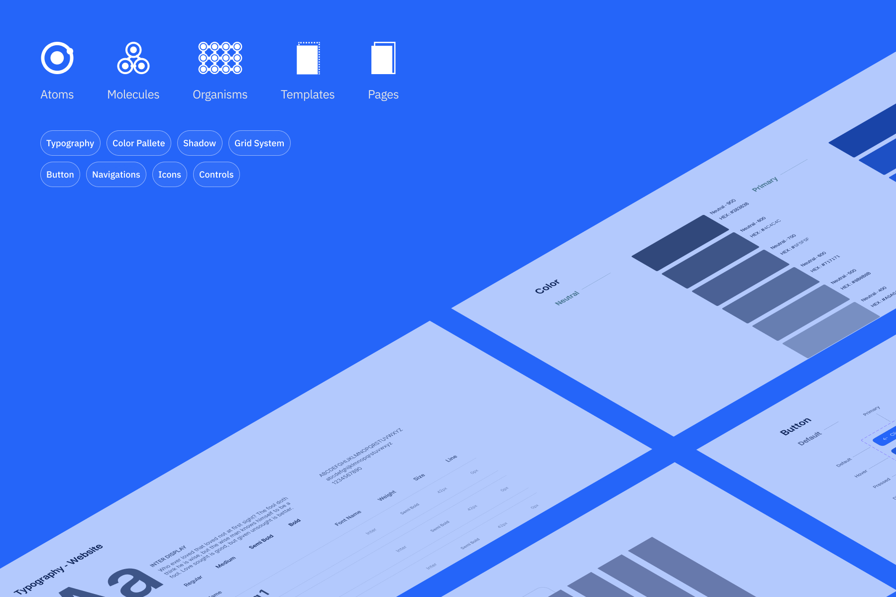
Build a design system that could be easily customized to suit any needs for our clients no more starting from scratch with each new project, no more inconsistencies between one deliverable and the next.
Making design changes across multiple projects sounds challenging, because each designer had their own working style.
Without a shared and manageable system, every update to a button, a color, or a spacing rule had to be made manually and sometimes things could break.
We needed something that solved two things at once "a single source of truth that could flex to fit different brand identities, without becoming so complex that it collapsed under its own weight."
---
Do we build one system per brand clean, focused, but expensive to maintain? Or one shared system that scales across all of them?
We explored both. One system per brand gave each product room to breathe, but any fundamental change meant touching every file separately. This works well if one person handles one project like Malvin doing Client Bank A, and Ikhsan doing Client Bank B. Or we build a single source of truth for design, so every design made and updated shares the same style.
Some of moment the designer have roll out project.
So we chose the single system. The idea was straightforward but not easy.
We build one solid foundation that's flexible enough to be adapted for any new project so when a new client comes in, the team isn't starting from scratch. We're customizing, not rebuilding.
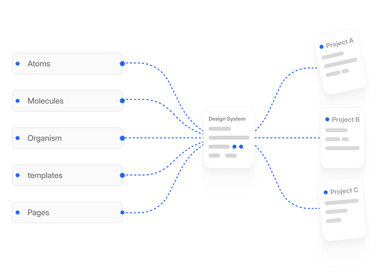
We started by researching how existing design systems create theirs brand scenarios, then mapping out which components were truly needed for our clients. Then, structured everything from low to high level called atomic design. We build from foundations first (color tokens, typography, spacing), then atoms, then the more complex components.
Every decision was documented with the why, not just the what because a component without context is just a shape.
In real application, this design system which we call Sephora made a real difference. New projects that used to require building UI components from the ground up could now start from a working foundation, cutting down setup time significantly and letting the team focus on the actual design problems instead of recreating the basics.
So let's walk through a scenario.
The Bank of Victory, with their red visual style, came to us. They provided the features they wanted to deliver to users, but didn't know where to start.
Once the design was created, we could focus entirely on client feedback. This cut down our time significantly — developers could focus on their side, and our team could produce designs as fast as possible. Speed mattered because the feature scope was large, and we worked with a scrum methodology for our clients' projects.
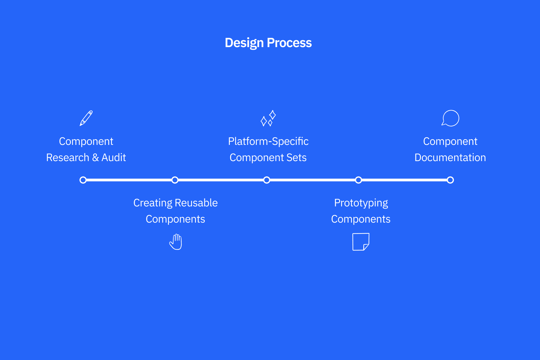
Let's Begin the design process
Component Research & Audit
Before creating anything new, we conducted a comprehensive audit of existing UI elements across products. We identified commonly used patterns, duplicated components, and inconsistencies.
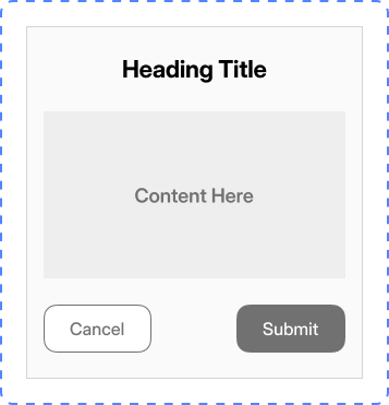
The goal was to consolidate similar elements into unified components that could be reused.What we looked for repeated UI patterns like buttons, input fields, tabs, modals and other inconsistent naming conventions or styles platform-specific needs (e.g., mobile touch targets, responsive layouts)
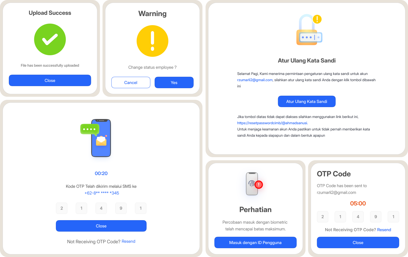
Creating Reusable Components
Once the audit was complete, we started building modular and reusable components. Each component was designed to be atomic in structure (button, input, checkbox, etc.)

Lorem ipsum dolor sit amet, consectetur adipiscing elit, sed do eiusmod tempor incididunt ut labore et dolore magna aliqua. Ut enim ad minim veniam, quis nostrud exercitation ullamco laboris nisi ut aliquip ex ea commodo consequat. Duis aute irure dolor in reprehenderit in voluptate velit esse cillum dolore eu fugiat nulla pariatur.
Block quote
Ordered list
Unordered list
Bold text
Emphasis
Superscript
Subscript